PreQL sits between a company’s source systems (ERP, CRM, warehouse, Excel) and the people who run the business on those numbers. Agents clean, reconcile and govern the data on the customer’s own infrastructure, so finance teams and AI tools read the same, approved definitions.
The buyer is technical, the daily user is not: data platform leads, finance ops and compliance. Every screen had to read clearly to a finance person and still hold up to the engineer sitting next to them.
The problem
The product is mostly invisible work: mappings, rules, definitions, versions. The team’s open question was whether users should only talk to the agent or also click things directly, and the existing flows mixed the two without a rule.
My role & decisions
Started with the data cleaning flow, then the semantic layer, governed metric answers and the audit log.
Key decision: the chat is the system of record. Users can type or manipulate the artifact directly, and every direct action posts an event back into the thread, so the screen and the conversation never drift apart.
Navigation cut to three parts: sidebar, the conversation, and the artifact it produces.
Every agent decision shows its sources, its confidence and a human owner, because finance signs off on numbers, not on models.
Built the brand, the website and the partnership deck in the same language, plus a clickable coded prototype for stakeholder calls.
Data cleaning. Easy issues resolve on their own and say why; the one real decision is framed as a question, with a recommendation.
Process
Short loops with the founders and the CPO: wireframes reviewed async, then a low-fidelity prototype where interactions came before styling. Each round moved one flow from “explained on a call” to “understood on its own”. The same components then carried the semantic layer, metric answers and version history.
Decisions that shaped the product
Import is a task, not a fact. Connecting a source only completes after a person resolves its semantic problems. Until then it shows as “discovering” and can’t be queried, so the steward never sees dirty data in the semantic layer.
One cleaning stepper, four problem types. Trivial fixes come pre-applied with undo, patterns get one accept for many rows, judgment calls go one record at a time, missing data asks you to “Get the data”. One pattern to learn.
Edit the decision, not the rows. Click the target value and every affected row updates. No Modify button; saving it as a rule is a checkbox at accept time.
Conflict blocks, waiting doesn’t. At publish, clean items go out, items waiting on an owner go out flagged, a real conflict stops the release and links straight to the fix. The less the system knows is true, the harder it stops.
The graph reads left to right and stays still. Sources, entities, metrics, consumers in columns instead of a node cloud. No animated “data flow” at rest: the published layer is frozen, and motion that suggests otherwise would be a lie.
The comparison view is the publish view. Only what changed, colour-coded new / changed / waiting, with “Publish as v{n}” in the footer. Reviewing and publishing always happen together, so they live on one screen.
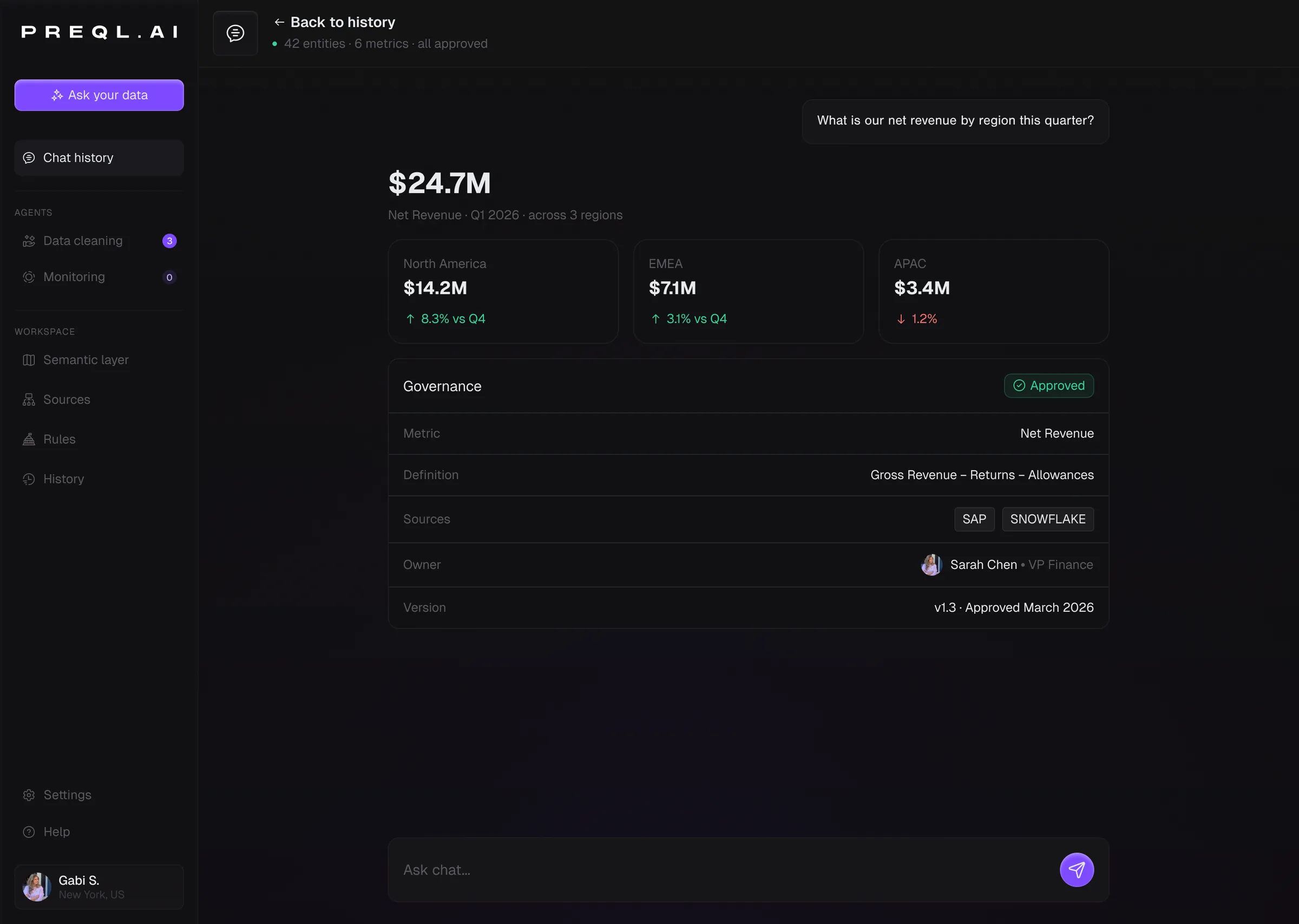
A governed answer. The number comes with its definition, its sources, its owner and its version.
Human in the loop, where finance already works. A metric change lands in Teams with its impact and one-click approval.
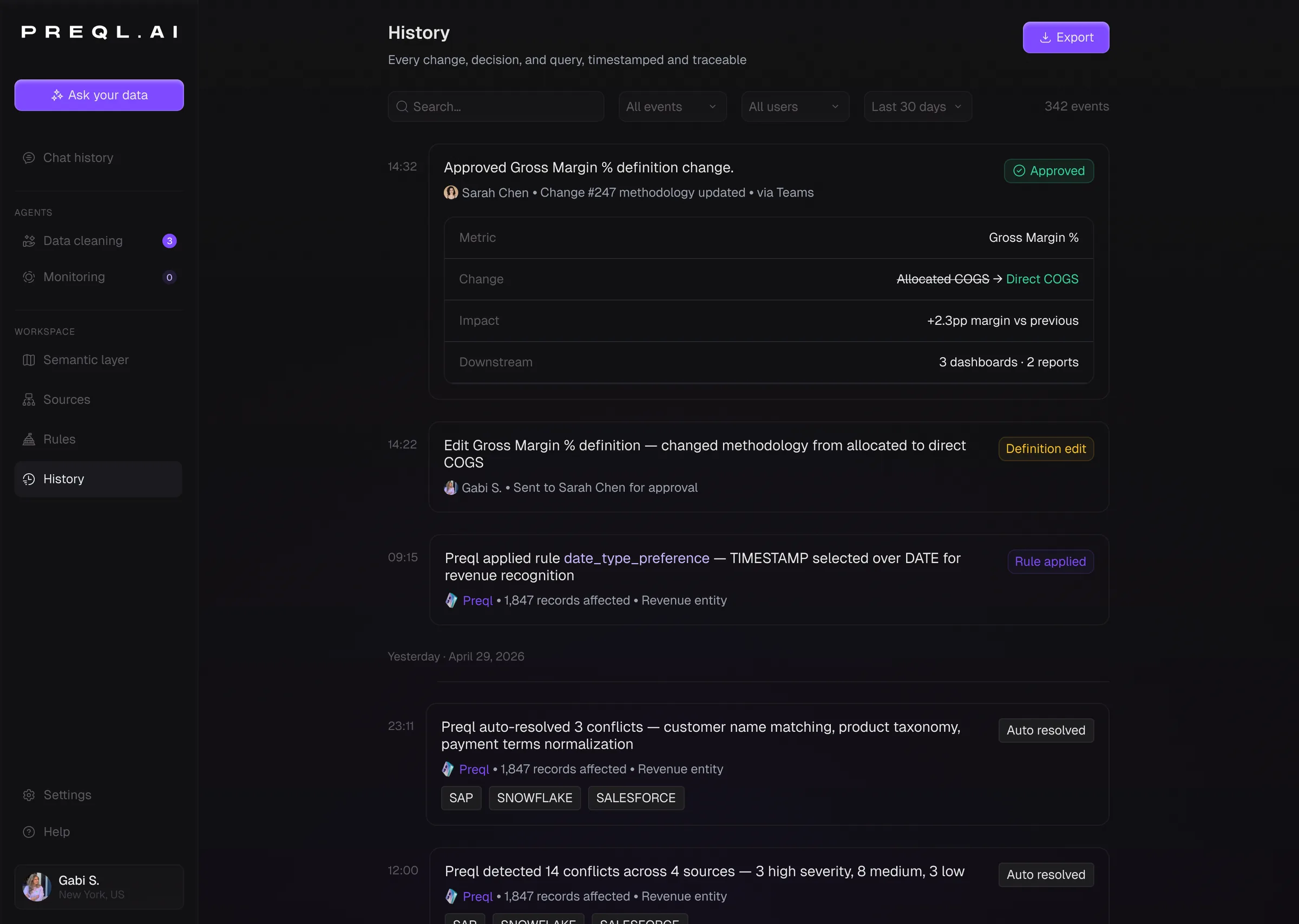
Audit log. Every change versioned like code, so “why did this number move” has an answer.
Brand & website
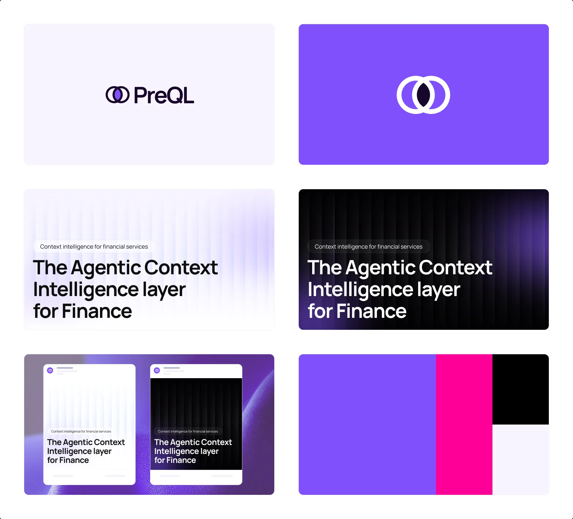
Two overlapping rings for the mark: two sources, one agreed meaning. Violet carries the product, black and soft lilac keep it serious enough for banks and insurers.
The brand on one board: wordmark, icon, banners in light and dark, the palette.
The website, top to bottom.
Results
PreQL raised $500K. The product screens, the investor-deck mockups and the partnership deck I designed were what they went to investors with.
The founders and the CPO approved the direction for the core flows: one simplified flow, the chat, the navigation and the artifact each in its own place.
A clickable, coded prototype the team demoed live on stakeholder calls and used as the build reference for engineering.
What I learned
A product this complex can’t be nailed in static screens. Working on a live prototype as a design engineer was what made it click: “can they click, or is it all chat?” stopped being a debate the moment the team could try both on the call. Interactions came first, pixels second, and decisions that would have taken a review cycle took an afternoon.